Case · Marta Barandiy · Brussels · 2026
Made to herown measure.Loud on purpose.
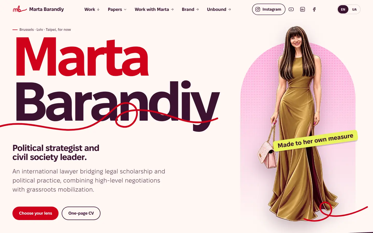
Marta Barandiy is an international lawyer, a political strategist and the founder of Promote Ukraine. She opened a new chapter and wanted a brand that fits who she is now. We started where it matters most: the brand, the fight it picks and the weapon it uses. On that system we then planned, built and polished her website and a set of interactive tools that replace long reads.
martabarandiy.com (opens in a new tab)Brand portal (opens in a new tab)
- Client
- Dr. Marta Barandiy, Brussels
- Built
- Brand identity and brand portal first; then the website and six interactive tools
- Languages
- English and Ukrainian, each written for its reader
- Method
- Design Thinking: empathise, define, ideate, prototype, test
- Run
- Since October 2026. Still running.
- Tools built
- VST-01 The Front Door VST-X Assemble Your Own
01 · The brief
A new chapter.No borrowed measure.
For years the measure was someone else's: male rooms, “what will they say”, fit in, take up less. Marta decided to stop checking herself against it.
What she asked for was clear. Be free of imposed standards and of trying to fit everywhere. Stop hiding the feminine side. Show that she is no longer afraid to be a woman in politics: strong, feminine and open. And stop publishing papers as long reads that people save and never finish.
The hard part was the audience. One site has to work for an MEP's assistant between meetings, a journalist on deadline, a caseworker at an NGO, and a Ukrainian mother reading on her phone on a night bus. A brand that only shouts loses the parliament office. A brand that only whispers loses everyone else.
A new chapter, and serious work locked in long PDFs most readers never open.
One voice, loud and precise at once. Her papers become tools people use, and every claim shows its source.
02 · Empathise
We listenedbefore we drew.
The run worked on several fronts at once, the Design Thinking way: empathise, define, ideate, prototype, test, and go back when the evidence says so. What matters is what each front left behind: something we could design with.
- 01
Working sessions with Marta
What she stands for, what she is done with, what this chapter should feel like.
→ What it gave usThe essence: free of imposed standards, strong and feminine in the same frame. It became the concept, «made to her own measure».
- 02
Conversations with her audience, clients, colleagues and supporters
What they read, what they skip, where they meet her work.
→ What it gave usSix kinds of readers, each needing different proof first. That became the “Who is reading?” lens that re-orders her front page.
- 03
Desk research
How policy readers use content, when interaction beats text, how women in politics are judged online, how refugees find information.
→ What it gave usReaders skim and copy, and interaction helps when the reader is the case. So papers became tools, and plain text stays wherever it is faster.
- 04
A peer scan
Personal sites of women policy experts, side by side.
→ What it gave usThe gap: sites are either an authority shelf or a warm guide. None combines authority, warmth and interaction. That gap is her position.
- 05
Testing the prototypes
Early versions of the pages and tools in front of real people.
→ What it gave usWhere people hesitated, the design changed. What worked became a rule in the system: the point on the first screen, one question at a time, a plain-reading version one tap away.
- 6reader types, each with its own way into her work
- 4journeys redesigned, from today's friction to a clear path
- 12“How might we” questions that shaped the tools
- 8design principles, each with a check anyone can run
03 · Step 1 · The brand
Pick the fight.Then the weapon.
We didn't start with a homepage. We started with the brand, because everything after it, every page, tool, slide and post, would inherit its decisions. So the first question was not “what should it look like?” but “what is it against, and what does it fight with?”
With the fight and the weapon named, every later choice had a test: does this measure her by someone else's ruler, or by her own?
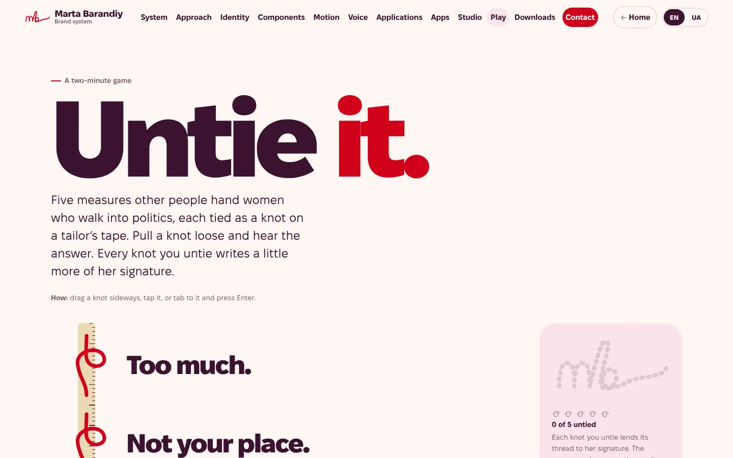
Other people's measure. The rulers women in politics get handed: too much, not your place, smile more, be less emotional, wait your turn. And the safe middle most brands retreat to.
Her own measure. A red thread that comes loose from the tailor's tape and becomes her signature, plus one rule that makes the loudness credible: no source, no fact.
04 · Step 1 · The idea
The tapecomes loose.
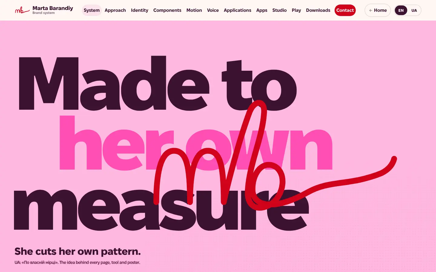
A tailor's tape measure stands for other people's standards. In this identity it comes loose, and the thread becomes her signature.
The monogram is “mb” written in one continuous red line: an m, a tall b, and a loose tail that keeps going. Every page carries the same thread, and it always means one thing: a decision, a link, or her voice.
In Ukrainian the idea reads «По власній мірці»: made to her own measure. It is the line behind every page, tool and poster.
05 · Step 1 · Why it's loud
Feminine.And fierce.
The research named the trap. Women in public life are punished for being too soft and for being too tough. Most brands answer with a safe middle. We went the other way.
- 01
Pink as a field, not a tint
Candy pink, magenta and lavender fill whole surfaces at poster size, right next to legal precision. Hard content sits on the feminine colour, so strength and warmth share one frame.
- 02
Type is the image
Fixel, a Ukrainian type family, set huge and tight. Headlines are questions in guillemets: «Is a baby not family?» Lines may run off the edge, because the idea is bigger than the frame.
- 03
One red thread per view
If everything is red, nothing is. One red element leads each screen, and italic red means one thing only: Marta is speaking, in her own words, with a source.
- 04
Silk, cut, hem, scale
Feminine means fabric and confidence here, never hearts or lipstick. She is drawn in a gold silk gown, standing tall and taking up the frame. The shapes come from the dressmaker's table: arch, hem, pill, rosette, knot.
We drew a quieter cream-and-red version too. It read like another lawyer's website. The loud one read like her.
06 · Step 1 · The brand portal
A brand bookthat works.
The brand was written down as a working site at martabarandiy.com/brand/, not as a PDF: twelve chapters in English and Ukrainian, built from the same CSS and JavaScript the website and the tools later loaded. That is where most of the thinking lives, and where the brand changed how her work behaves, not only how it looks.
What the brand changed
- A tailor's tape: other people's standardbecomesA loose thread that writes her signature
- A “serious” section and a “soft” sectionbecomesHard content on the feminine colour, at poster size
- Long PDFsbecomesTools named after the question they answer
- Claims that rely on reputationbecomesEvery claim labelled fact, interpretation or hypothesis, with its source
- Bouncy, decorative animationbecomes“Fabric, not bounce”: motion only as a reply to the person
- The same rounded card in every gridbecomesShapes with one job each: arch, hem, pill, rosette, knot
- A cookie banner and a newsletter pop-upbecomesNothing to accept, nothing kept, no one chased
- 01
Voice
Direct, warm, precise, jargon-free. Questions before facts, always an “I don't know”, and no “Hub”, “Smart” or “AI” in a tool's name. English and Ukrainian are each written for their readers, never translated word for word.
- 02
Motion
Silk curves, four durations, one orchestrated moment per screen. You choose, a knot ties; you scroll fast, the hem ripples. With reduced motion, the same story without the travel.
- 03
Components
Buttons where a knot ties on press, a tape slider whose measure “belongs to the person holding it”, claim labels, progress knots instead of percentages.
- 04
Studio
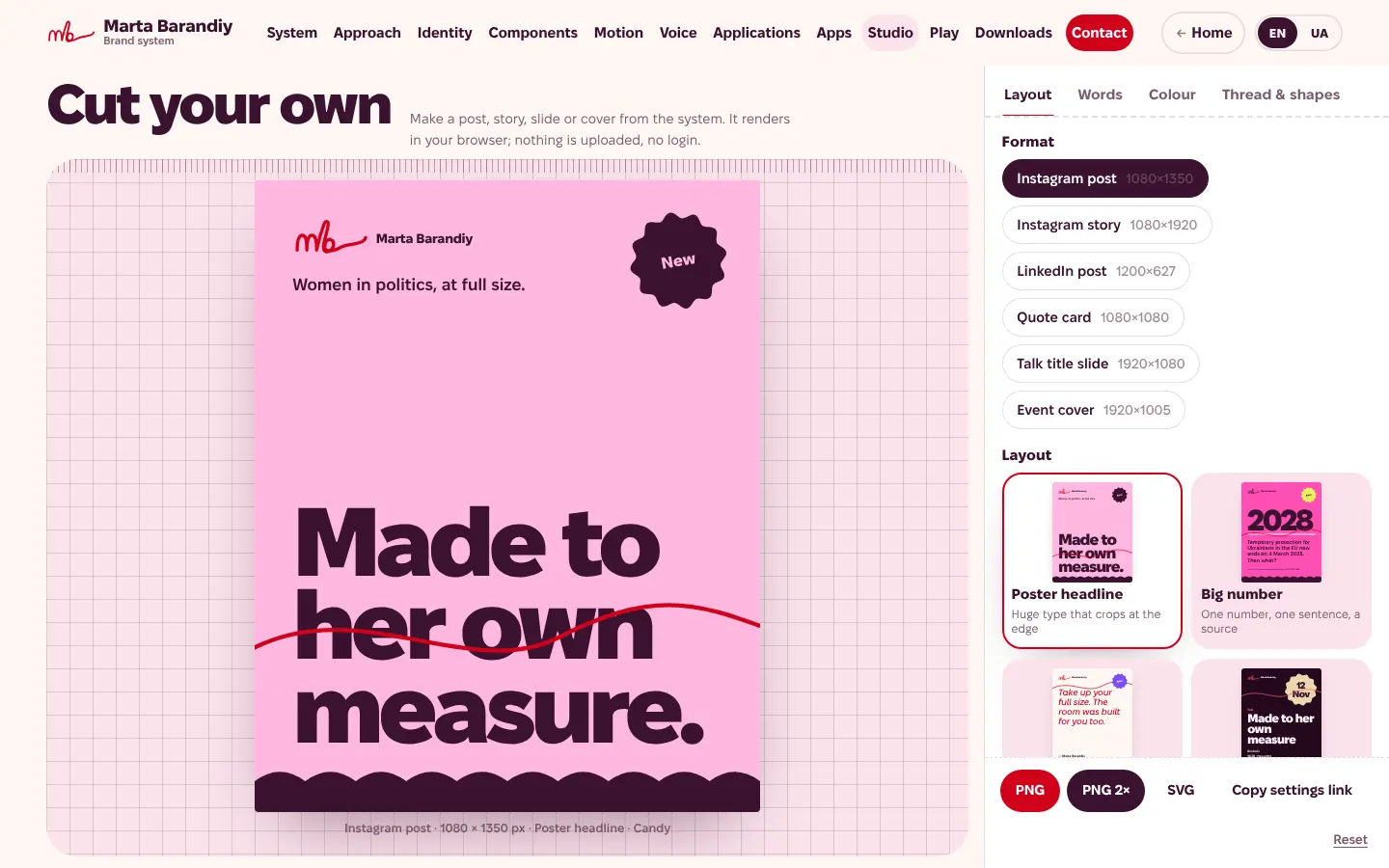
“Cut your own”: her team and partners make posts, stories, slides and covers in the browser. Contrast is checked live, quotes and numbers ask for a source, nothing is uploaded.
- 05
Play
“Untie it”, a two-minute game: five measures tied as knots on a tape. Untie them and the thread writes her signature, then finish the sentence “I no longer measure myself by…”.
- 06
Five registers
Personal, policy, poster, stage and Ukraine: the same thread walking into different rooms, from a parliament office to a dark conference hall.
07 · Step 2 · The website
Built onthe brand.
With the system in place, the website was planned, built and polished on top of it. The research decided what goes where; the brand decided how it looks, sounds and moves. Each finding became one decision.
FindingPolicy readers skim, forward and copy.
DecisionThe point fits on the first screen. Every paper opens with a question, the claim in forty words or fewer, and how long it takes. Citations copy in one tap.
FindingEach reader needs different proof first.
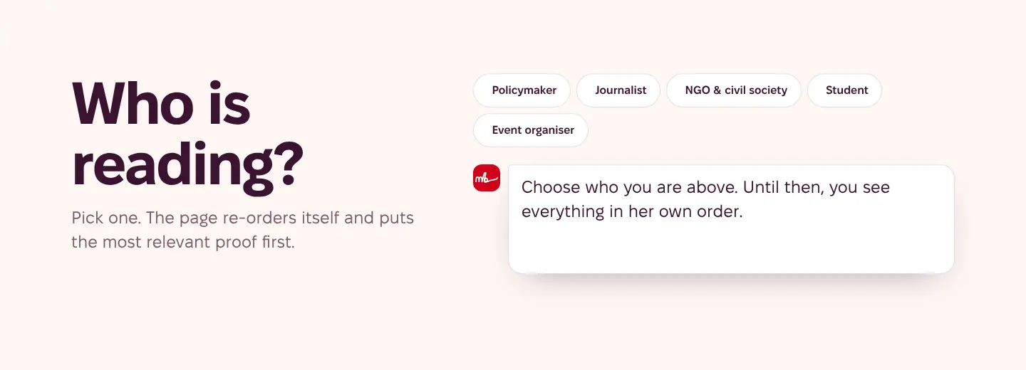
DecisionThe front page asks “Who is reading?” Pick policymaker, journalist, NGO, student or event organiser, and the page re-orders itself to put the most relevant proof first.
FindingInteraction helps when the reader is the case.
DecisionTools where people put in their country, family or situation and see what changes. Plain text where interaction would only slow them down.
FindingTrust needs sources, not reputation.
DecisionEvery claim shows its kind (fact, interpretation or hypothesis) and links to where it came from. Unknown stays “unknown”.
FindingUkrainians in Europe read on phones, often worried.
DecisionDesigned at 360 px first, Ukrainian as a first-class language, one calm question per screen, and nothing leaves the phone.
08 · Step 2 · Tools, not texts
Papers youcan use.
Nobody finishes a thirty-page policy brief on a phone. So her papers became tools: you answer first, then the facts arrive, each with its source. The full paper is still there, at the end.
Every tool, in this order
- Hook question
- Choices, always with “I don't know”
- Reveal: one number, one sentence
- Progress knots
- Something to keep
- Sources
-
 Policy brief · Egmont Institute
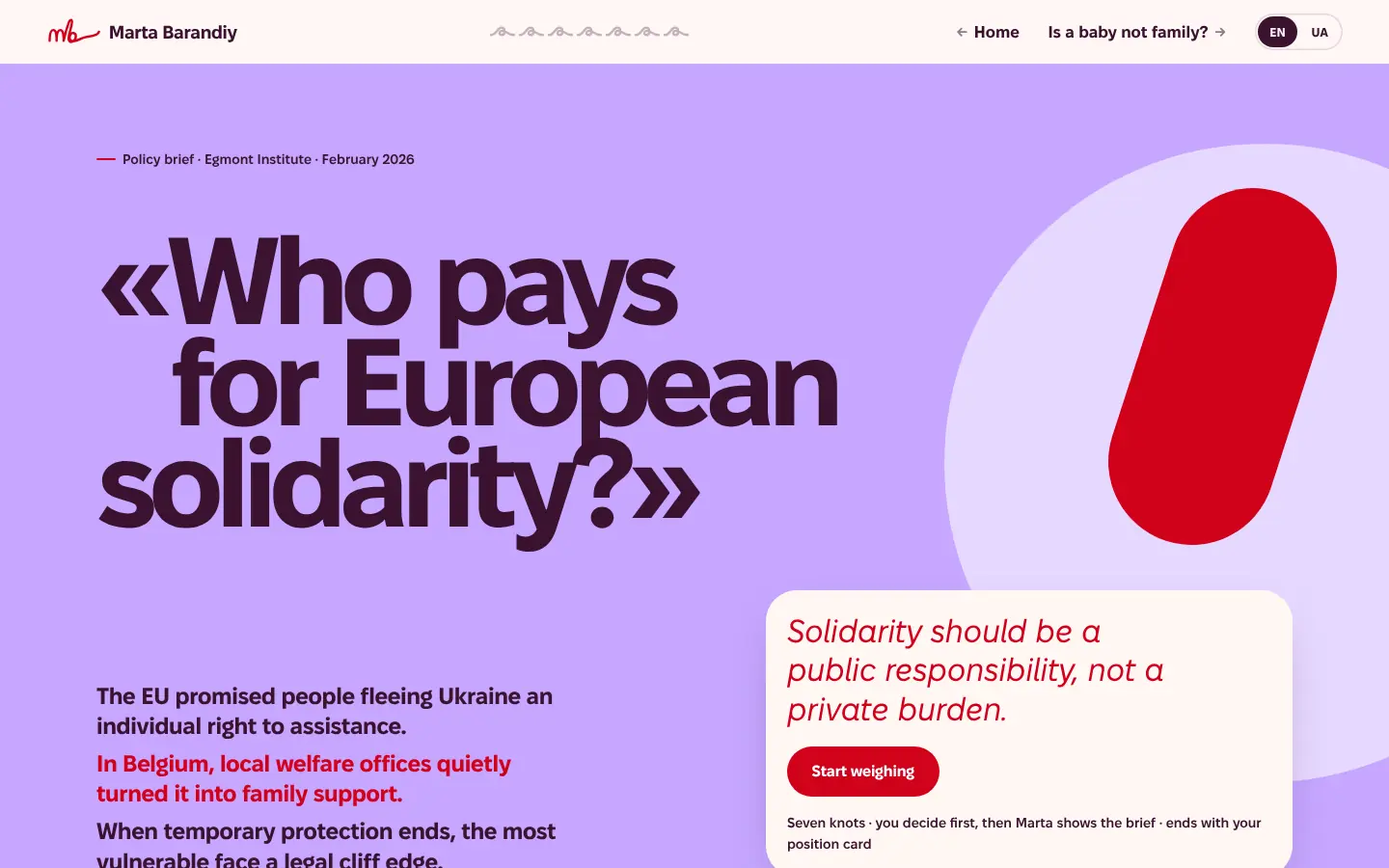
Who pays for European solidarity?
You weigh the trade-offs first, then Marta shows the brief. Seven knots, and it ends with your own position card.
Open the tool (opens in a new tab) -
 Advocacy case · Belgium
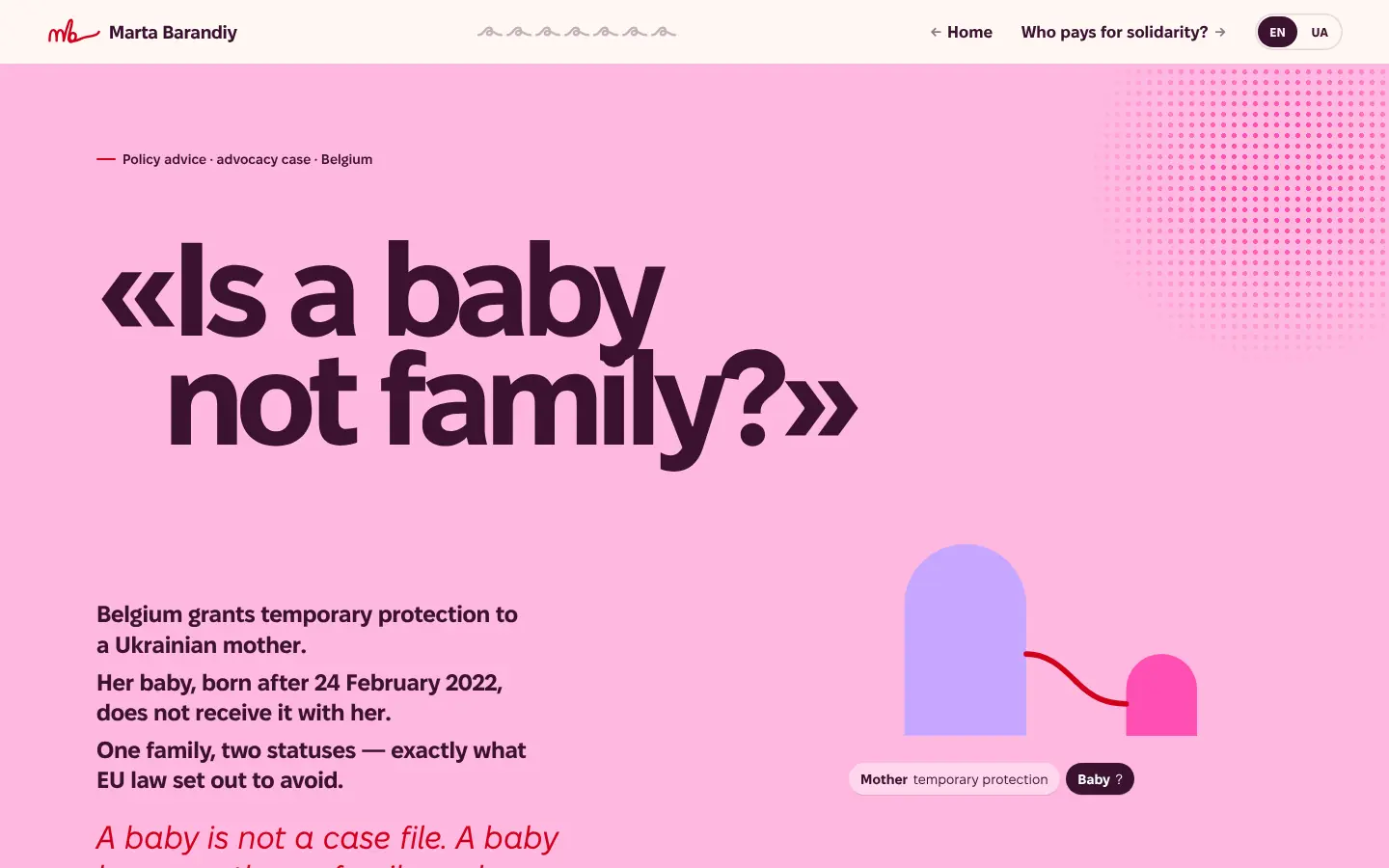
Is a baby not family?
Follow one family through one legal gap, knot by knot: a mother with temporary protection, and a baby born after 24 February 2022 without it.
Open the tool (opens in a new tab) -
 Method
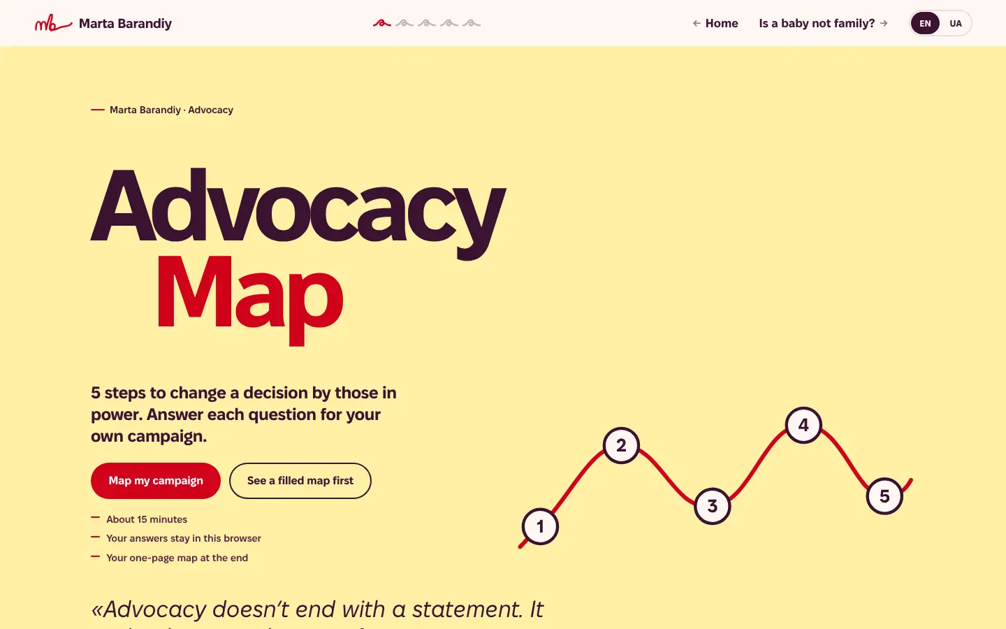
Advocacy Map
Five steps to change a decision by those in power. About 15 minutes for your own campaign, and a one-page map at the end.
Open the tool (opens in a new tab) -
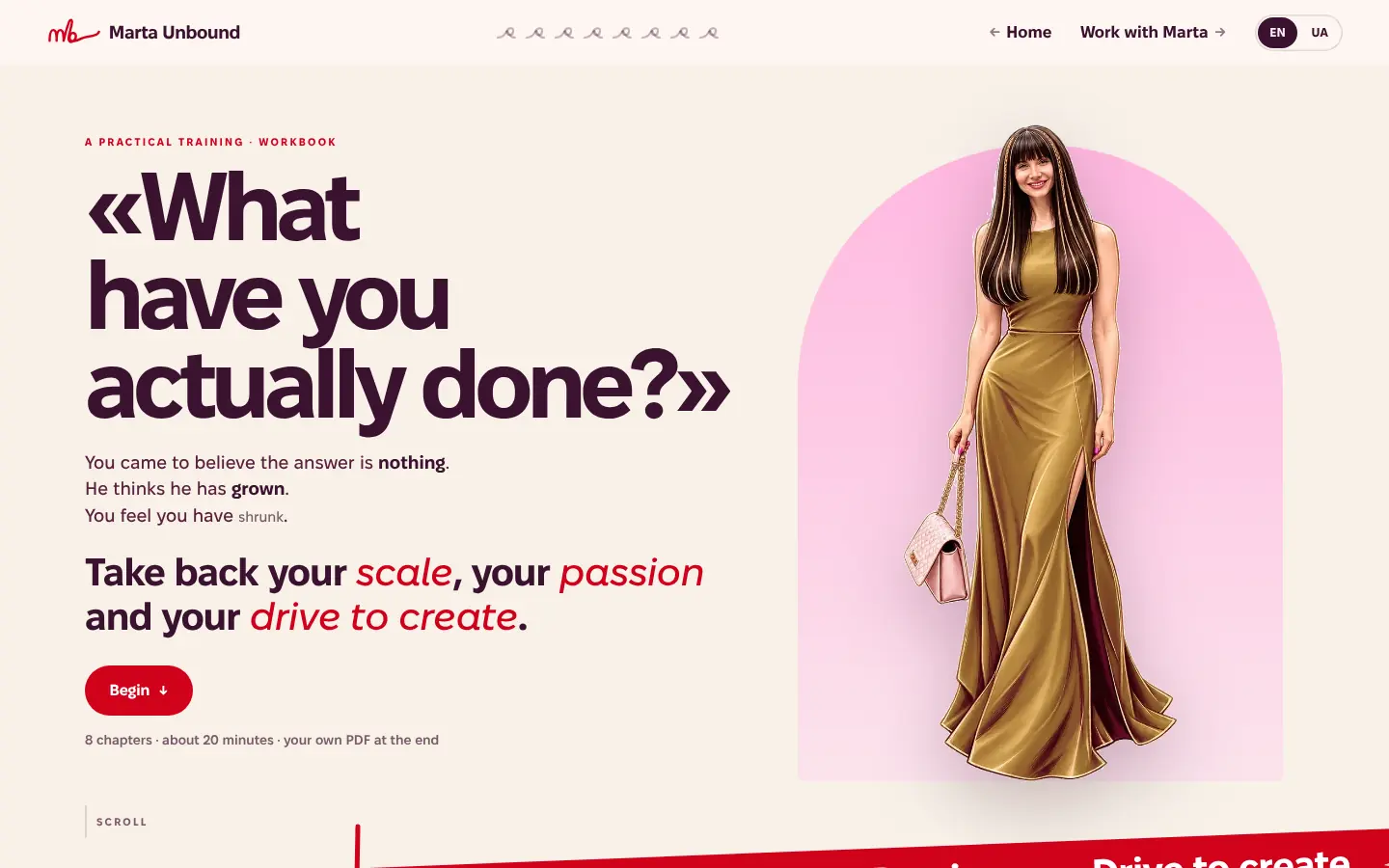 Training · EN and UA
Marta Unbound
«What have you actually done?» Eight chapters, about 20 minutes, and your own workbook as a PDF, built in the browser.
Open the tool (opens in a new tab) -
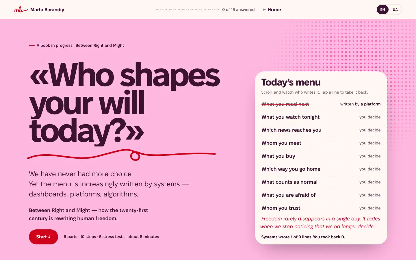 Book in progress
Between Right and Might
«Who shapes your will today?» A companion to her book: six parts, five stress tests, about five minutes, asking who still decides for you.
Open the tool (opens in a new tab) -
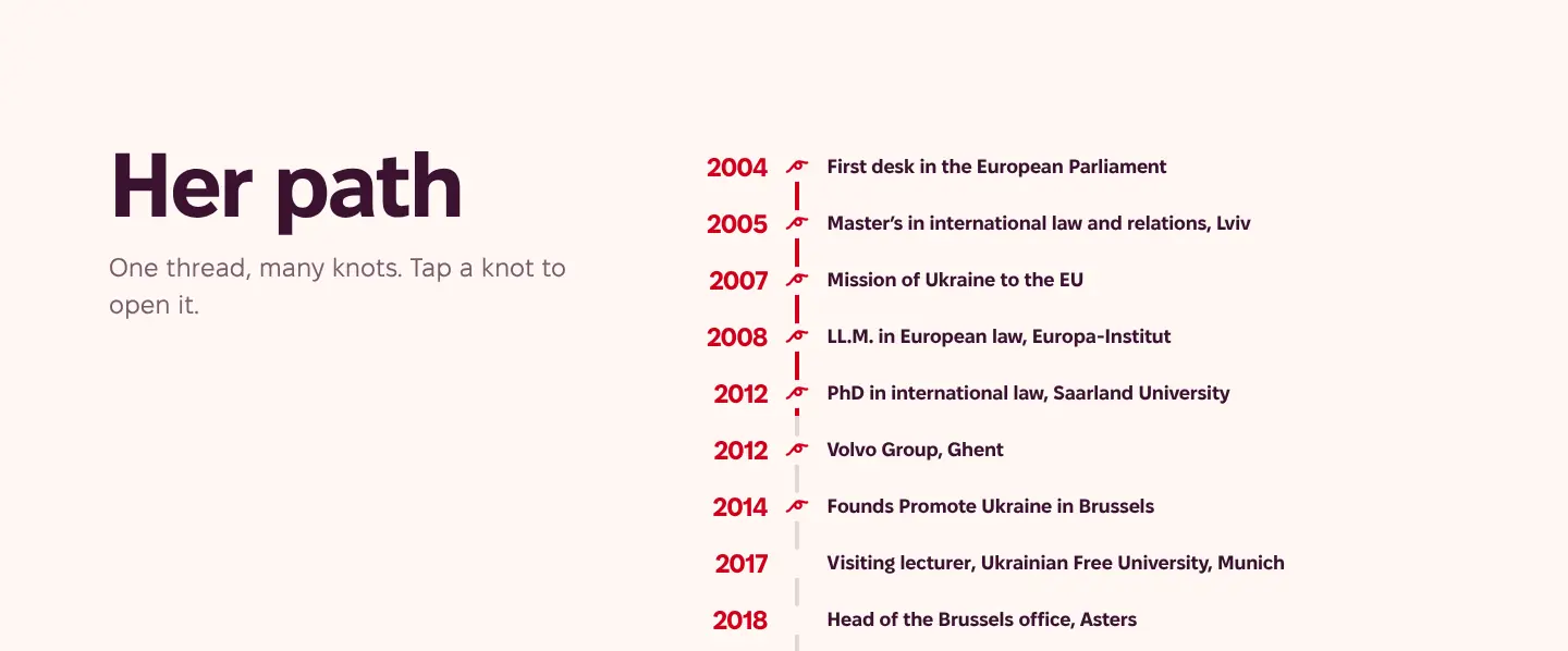 Front page
The interactive CV
Her path as one thread with knots, a guess-the-year game, and facts as posters. Every item links to its source.
Open the tool (opens in a new tab)
Each tool is its own program.
Every paper is a separate, self-contained app: its own data, its own English and Ukrainian text, its own styles and logic. The tools share one design system and nothing else. A tool loads only on its own page, needs no account, keeps answers in the reader's browser, and keeps working offline once it has loaded.
That is the part most personal sites don't have. They offer a shelf of PDFs. Marta's site lets the reader be the case.
Under the hood
- WordPress + a custom core plugin
- Framework-free JavaScript, one bundle per tool
- One token and component library (CSS cascade layers)
- PDFs built in the browser
- Fixel, self-hosted
- No trackers, no third-party requests
09 · Step 2 · Imperfect on purpose
Not polished.On purpose.
Smooth, symmetrical, gradient-perfect pages are now easy to generate, and they all look alike. We wanted the opposite: a site that could only be hers.
So the design stays simple and a little rough. The thread is drawn, not ruled. Words crop at the edge of the screen. Halftone dots sit around the portrait like ink on a printed poster. The “new” sticker is tilted by hand. The brand portal says it plainly: “the same rounded card everywhere is the slop we avoid”, and the illustration brief rules out “generic AI faces”.
Imperfections are part of life. Hiding them makes a brand look generated. Keeping them makes it look made by people, for a person.
10 · Still moving
Work inprogress.
The run isn't over. The site keeps changing as Marta's work does. New papers become new tools, the system grows, and each tool takes less time to build than the last because the pieces already exist.
A brand made to someone's own measure has to be refitted as she moves. That is the plan, not a flaw.
If your work is serious and your website still reads like a shelf of PDFs, that's the kind of run we do.
Run: in progress. The site is still changing.